The interface mirrors that sequence so users always know whether they are waiting on upload, inference, or rendering. That alignment is what keeps the experience calm when latency exists.
Design case study
BloomScan
Turn a single photo into an identifiable plant profile—care and safety included—without burying people in botanical databases.
Project links
Why this exists
Problem
Plant ID apps often dump Latin names and long care articles before answering the simple question: “What is this, and is it safe on my balcony?” That mismatch makes the result feel technical instead of actionable.
BloomScan was framed around immediacy: one photo in, a structured profile out—identification, care basics, and safety signals in a scan-friendly layout.
Intent
Goals
- Fast read — Make the first screen after analysis answer name, confidence, and “what do I do with this plant?”
- Structured output — Use repeatable blocks (colors, season, light, water) instead of one long paragraph.
- Honest uncertainty — Leave room for low-confidence states without pretending the model is infallible.
- Shippable UI — Keep scope to a front-end that could plug into a real service later.
Ownership
Role & scope
What I owned
Screen structure for upload, loading, success, and error paths; presentation of results; spacing and hierarchy so dense plant data stays scannable.
Scope & constraints
In scope: responsive layout, component states, copy tone for errors and empty uploads.
Out of scope: training a new vision model from scratch or building a full plant encyclopedia backend.
How the work moved
Process overview
Same rhythm as other work on this portfolio: frame the user job, map states, design screens, then tighten with a running build.
- 01Frame — Define the “happy path” and the failure states users actually hit (bad lighting, wrong file).
- 02Map — Wire upload → processing → result so the UI never leaves the user guessing what the app is doing.
- 03Design — Lock a card system for species + care + safety.
- 04Refine — Reduce chrome; test on small widths where one-handed use matters.
Framing
Research & insights
Informal review of existing plant apps and a few hallway conversations—not a formal study. The pattern was consistent: people screenshot results, they do not read five paragraphs.
- Users want scannable badges (light, water, season) before deep text.
- Errors need tone — a failed scan should read as “try again,” not as a stack trace.
- One primary action per step keeps the flow honest on mobile.
Intentional choices
Key design decisions
-
Dedicated analysis state
Decision: Show an explicit “working” surface between upload and result.
Why: Silent waits feel broken; users retry or leave.
Usability: Sets expectations and reduces duplicate submissions.
-
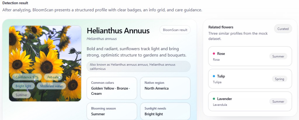
Profile cards over prose
Decision: Break species, care, and safety into bounded regions.
Why: Dense paragraphs hide the one line someone came for.
Usability: Eyes land in the same place after repeat use.
-
Photo-first hierarchy
Decision: Keep the user’s image visible alongside results.
Why: It anchors trust—“this output belongs to this photo.”
Usability: Easier to compare when scrolling on a phone.
-
Limited branching
Decision: Avoid extra modes; one scan path with clear recovery.
Why: Scope stayed small; depth lives in the result, not the menu.
Usability: Faster completion for first-time visitors.
Structure
Designing the identification pipeline
From a design angle, the product is a pipeline: image in, normalized response out, then a presentation layer that turns raw labels into a profile people can act on. The UI’s job is to make each stage legible—not to expose every technical detail.
Request → profile (simplified)
async function analyzePhoto(file) {
  setStatus("processing");
  const raw = await requestIdentification(file);
  return mapToProfile(raw);
}
Upload → Service → Structured UI
Evolution
Iteration & refinement
Early layouts leaned on a single scrolling column. Later passes separated scan, status, and result so each state had breathing room and clearer primary actions.
Outcome
Final product
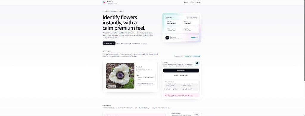
- Scan path — One obvious entry for the photo that drives the rest of the screen.
- Result grid — Care facts broken into scannable units.
- Status language — Errors and waits written for humans, not logs.
Implementation
Build snapshot
The front end is built as components that mirror the flow above—so state changes in code line up with what users see between upload and profile.
Closing
Reflection & next steps
Insight: The biggest win was treating latency as a first-class design problem—without that middle state, the rest of the UI feels untrustworthy no matter how polished the result card is.
Tradeoff: A thinner feature set meant less “wow” on paper, but it kept the story honest for a student timeline.
Next: Test with a handful of non-expert users on real garden photos; add explicit accessibility review for color-only cues; document confidence thresholds in the UI copy.