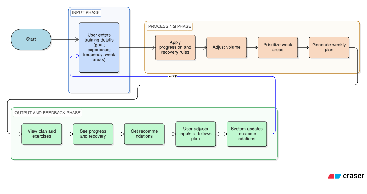
Training parameters map to simple branches (goal type, frequency, recent performance). That keeps the mental model honest: the UI reflects decisions users can understand.
Design case study
PracticePlanner
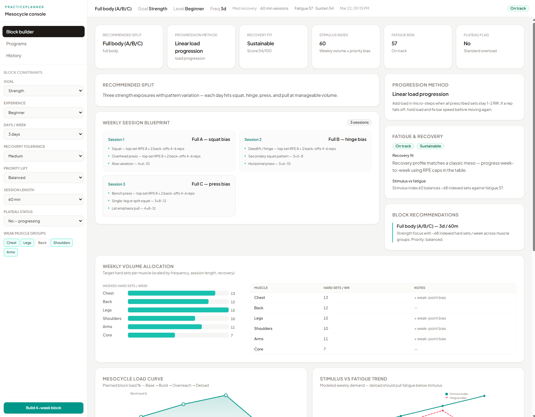
A structured training planner that turns goals and habits into a clear weekly plan—without dumping coaching jargon on the user.
Project links
Why this exists
Problem
Consistency usually breaks before “motivation” does. People skip sessions when the week has no spine—when the next workout is fuzzy, when last week’s work does not feel accounted for, or when the app reads like a long form nobody wants to reopen.
PracticePlanner targets that behavior: reduce overwhelm, make the weekly structure obvious, and surface progression in plain terms so users can answer “what do I do next?” without digging.
Intent
Goals
- Clarity — Make the weekly split and next actions obvious at a glance.
- Guided progression — Surface progression and recovery context without overwhelming detail.
- Adaptive feel — Allow the plan to respond to input changes in a way that still feels controlled.
- Honest scope — Ship a credible front-end prototype focused on flow and layout, not a full coaching backend.
Ownership
Role & scope
What I owned
Interface layout, component structure, interaction flow between “plan,” “progression,” and “recommendations,” and how system outputs are shown in plain language.
Scope & constraints
In scope: dashboard UX, rule-based plan presentation, responsive layout, prototype deployment.
Out of scope: full coaching certification logic, wearable integrations, or a production data pipeline.
How the work moved
Process overview
The project moved from framing the problem, to structuring inputs and outputs, to shaping the interface, then tightening through iteration and build.
- 01Frame — Clarify who the product is for and what “good” looks like in the UI.
- 02Structure — Map goals → plan → tracking → adjustments so the app mirrors real habits.
- 03Design — Turn that structure into modules users can scan in order.
- 04Refine — Use layout passes and the live prototype to reduce noise.
Framing
Research & insights
This was desk research and self-directed framing rather than a formal study: what breaks planning apps is rarely “missing a graph,” it is unclear sequencing and too much at once.
- Users abandon planners when the next step is ambiguous.
- Mixing education and execution on one screen increases drop-off.
- People want rules they can trust, presented as guidance—not a black box score.
Intentional choices
Key design decisions
-
Stepped plan generation
Decision: Break setup into a short sequence (goals → constraints → plan) instead of one long page.
Why: Long single-page forms invite mid-task abandonment; users lose the sense of progress toward a finished week.
Usability: Smaller chunks lower cognitive load and make corrections localized—you fix one step without redoing everything.
-
Planning separate from tracking
Decision: Treat “generate / lock in this week” as its own moment before mixing in history or tweaks.
Why: One surface doing both creation and review forces comparison against noise before the plan feels settled.
Usability: Users get a clear commit point: first answer “what is my week?”, then revisit “how did it go?”
-
Modular cards, fixed locations
Decision: Place progression, recovery, and guidance in bounded cards that stay in predictable grid positions.
Why: After training, attention is low; an endless scroll makes people hunt for the same information each visit.
Usability: Scanning becomes habitual—eyes go to the same region for the same question, which cuts time-to-answer.
-
Fewer inputs, stronger defaults
Decision: Limit configuration and let defaults carry most of the structure for this prototype.
Why: Open-ended controls read as “work” and increase bad combinations; for a student scope, explainability mattered more than infinite tuning.
Usability: Faster completion, fewer dead ends, and a plan that still reads as intentional rather than random.
Structure & logic
Designing the planning system
The system was designed to balance enough structure to feel dependable with enough room to adapt when goals or availability shift—without turning the product into a spreadsheet. Inputs roll into a small set of readable rules so the interface can show why the week looks the way it does, not only what to lift; the diagram and code sample exist to make that relationship visible, not to document a production backend.
Plan generation logic
if (goal === "strength") {
  sets = 5;
  reps = 5;
} else if (goal === "hypertrophy") {
  sets = 3;
  reps = 10;
}

plan = buildPlan({ sets, reps, frequency, performance });
Goal → Rules → Plan → Adjustments
Structuring the user flow
The diagram kept the team aligned on order: what the user sets first, what the system returns, and where feedback loops back in.
Evolution
Iteration & refinement
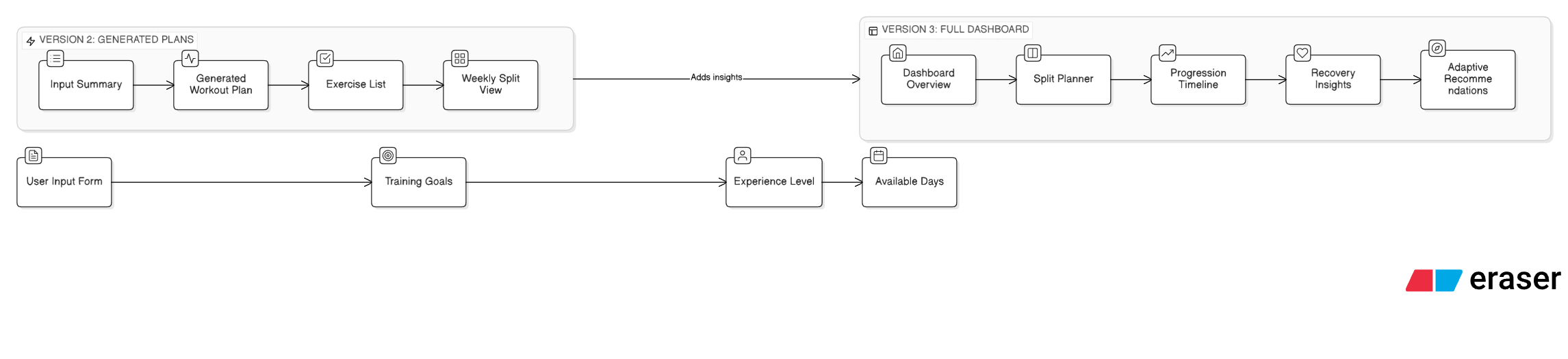
Earlier layouts read closer to a generic form. Later passes pushed content into a dashboard rhythm: fewer competing focal points, stronger alignment between labels and data.
Outcome
Final product
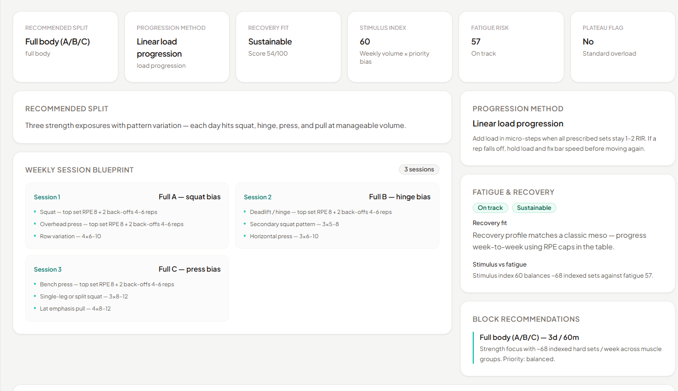
- Weekly split — Anchors the week so decisions are localized.
- Progression strip — Makes “what changes next” visible without a separate analytics view.
- Recovery & tips — Short copy blocks support pacing without turning into a manual.
Implementation
Build snapshot
A rules-based core keeps outputs consistent: similar inputs produce a coherent week instead of one-off screens that fight each other. Showing a slice of real code ties the layout to behavior—it is proof the dashboard is built as composable pieces, so spacing, states, and hierarchy were tested where users actually see them.
Closing
Reflection & next steps
Insight: The clearest gains came from ordering—what users commit to before they see secondary detail—not from incremental styling. When the sequence matched how people actually plan a week, the rest of the interface had less explaining to do.
Tradeoff: Favoring clarity meant pulling back on deep customization; that was the right cut for a prototype, but a wider audience would need clearer paths for edge cases (injury weeks, travel, deloads) without reopening the whole form.
Next: Short sessions with a few real lifters on first-run completion and “find what changed next week”; tighten conflict feedback when inputs disagree (frequency vs. recovery); run an accessibility pass on dense data blocks.